— Intelligence
Made Visible


Project
The identity starts by stripping away everything the category expects. Intellectual property design has its clichés, Enginuity™ refuses them entirely. The foundation is monochromatic: black and white, not as an aesthetic choice but as a statement of clarity and precision. AI-generated imagery works in support, outline forms, near-human in shape, suspended on undefined backgrounds. They don't explain the platform. They create space around it. The intelligence system and its results come first; the imagery contextualises without competing.
At the centre of the system is the Nod — a symbol built on dynamism. It morphs between states depending on where it sits in the process, each stage carrying specific meaning. It functions as the bridge between the system's logic and its outputs. The typographic system mirrors the same duality: bold sans-serif in deliberate contrast with a custom supporting typeface built on the same visual grammar as the Nod — somewhere between letterform and particle. The same tension that defines the palette defines the type. Monochromatic and hybrid. Precise and generative.
The aim was to avoid the obvious. AI and IP are spaces that default fast to the same visual vocabulary, clinical, abstract, interchangeable. The brief here was to detach completely, double down on what the platform actually produces and build a brand anchored in the intelligence of its results, not in what the category looks like. Enough restraint to feel authoritative. Enough strangeness to create genuine curiosity.
Role
Brand Design & Creative Direction
Strategy Director
Alex Bradley
Studio
Freelance
Output
Brand Identity, Brand System Design, Art Direction, Marketing Design
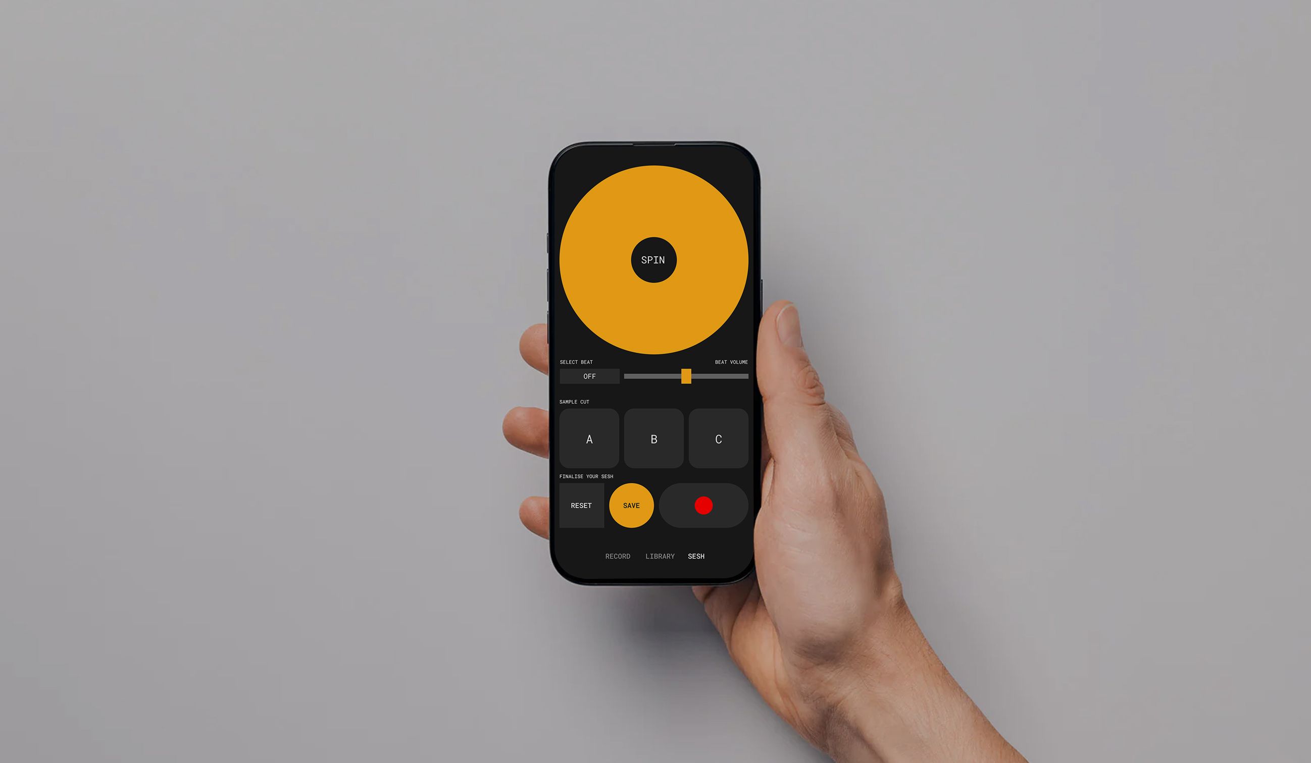
MONO
[Coming Soon]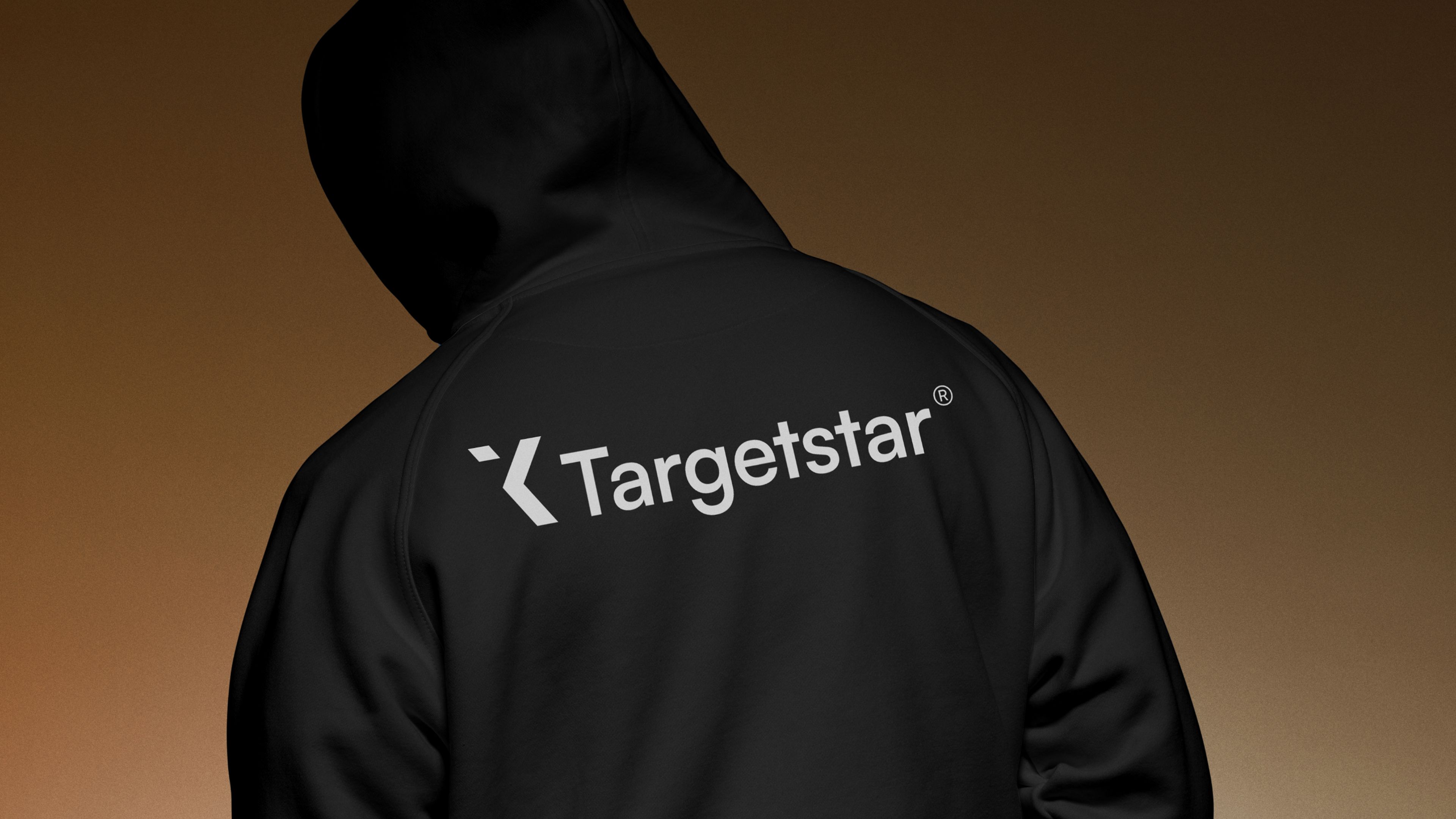
Targetstar
AmaWaterways
[Confidential]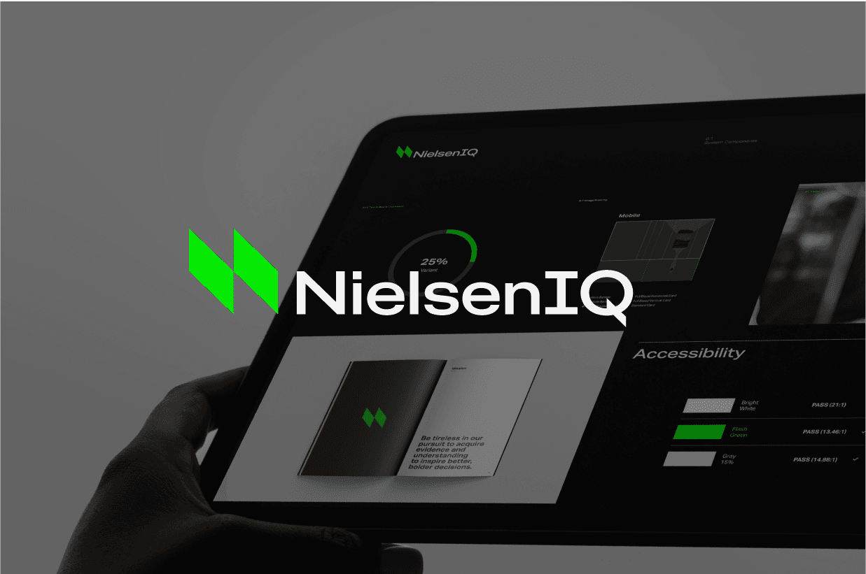
NielsenIQ
Approach
Jio
Leica
Coca-Cola
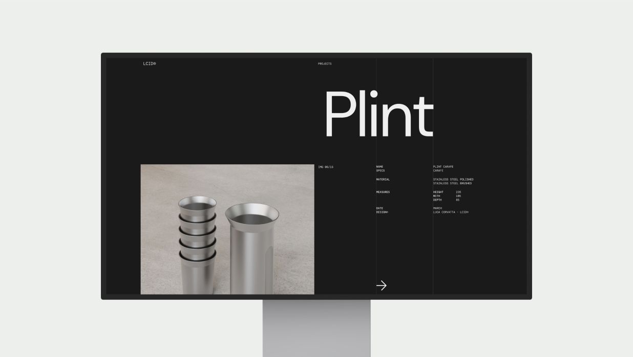
LCID
Supmates NFTs
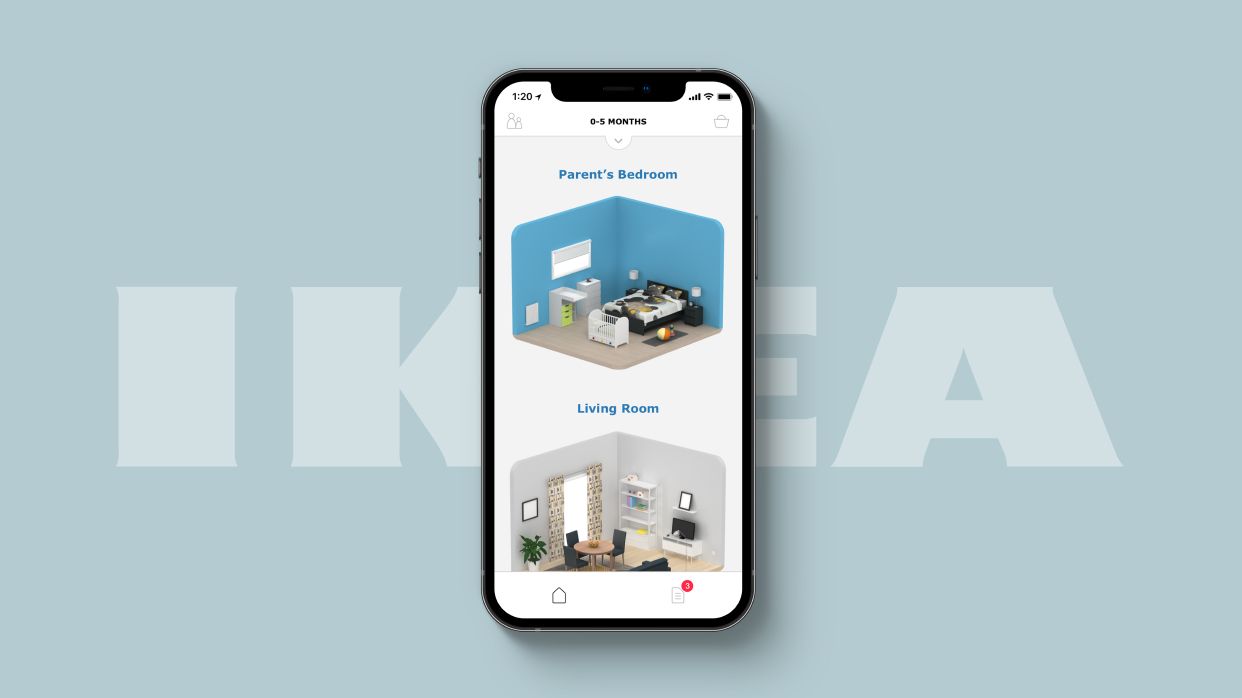
IKEA
Disney
MONO
[Coming Soon]Targetstar
AmaWaterways
[Confidential]NielsenIQ
Approach
Jio
Leica
Coca-Cola
LCID
Supmates NFTs
IKEA
Disney
MONO
[Coming Soon]Targetstar
AmaWaterways
[Confidential]NielsenIQ
Approach
Jio
Leica
Coca-Cola
LCID
Supmates NFTs
IKEA
Disney