— Precision is
The Brand


Project
Targetstar® began as a brand built around physical and digital performance tools for skeet athletes. The brief evolved into something larger — an umbrella brand with the range to carry a growing ecosystem while staying anchored in what the brand actually stands for. Two pillars hold the narrative together: technology — sharp, precise, built to elevate — and the athlete, disciplined to improve, working from the top to go further. Sport as a practice of self-improvement. Performance and technology as the engine. The visual identity reflects both: high contrast, built to stretch between digital and physical without losing its edge — highly recognisable and a fresher take on a space that tends to look like everything else.
The visual identity was crafted to convey confidence, reliability, and energy, appealing to both experienced players and a new generation entering the sport. A clean, understated palette is anchored by a vivid orange accent, a direct reference to the clay target, chosen for both its recognizability and visual clarity in outdoor conditions. This system was extended across the digital experience, ensuring accessibility and usability across varied environments, from in-the-field tracking to post-session analysis.
Collaborating closely with the UX team, I helped translate the brand’s visual and strategic foundations into an app experience that reflects its values, highly functional, responsive, and designed to adapt intuitively to user needs.
Role
Brand Design & Design Direction
Studio
Freelance
Output
Brand Strategy, Brand Identity, Brand System Design, Art Direction, Marketing Design
Renders
SABOTAGE Studio

AmaWaterways
[Confidential]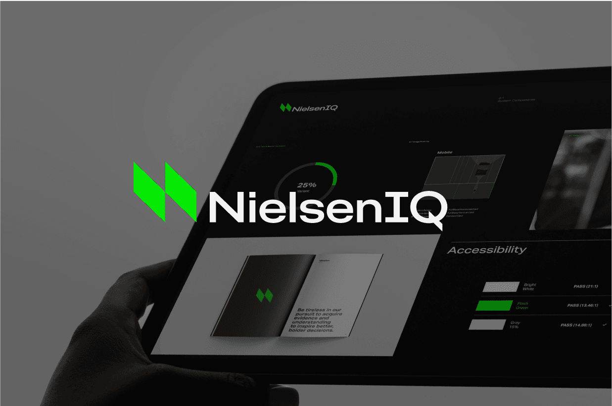
NielsenIQ

Approach
Jio
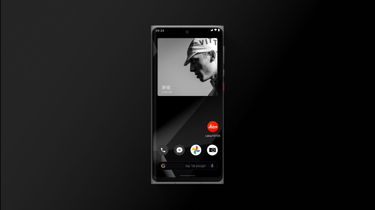
Leica
Coca-Cola
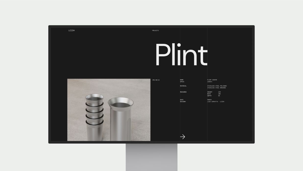
LCID

Supmates NFTs
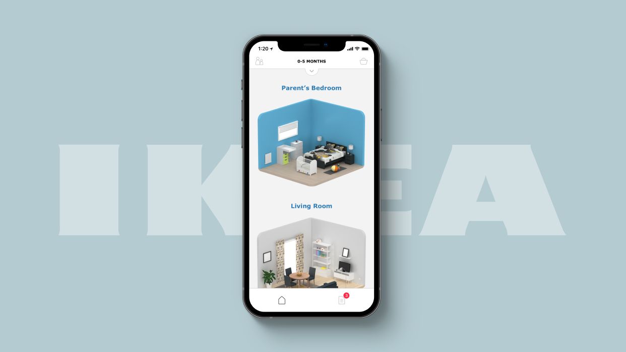
IKEA

Disney

Enginuity
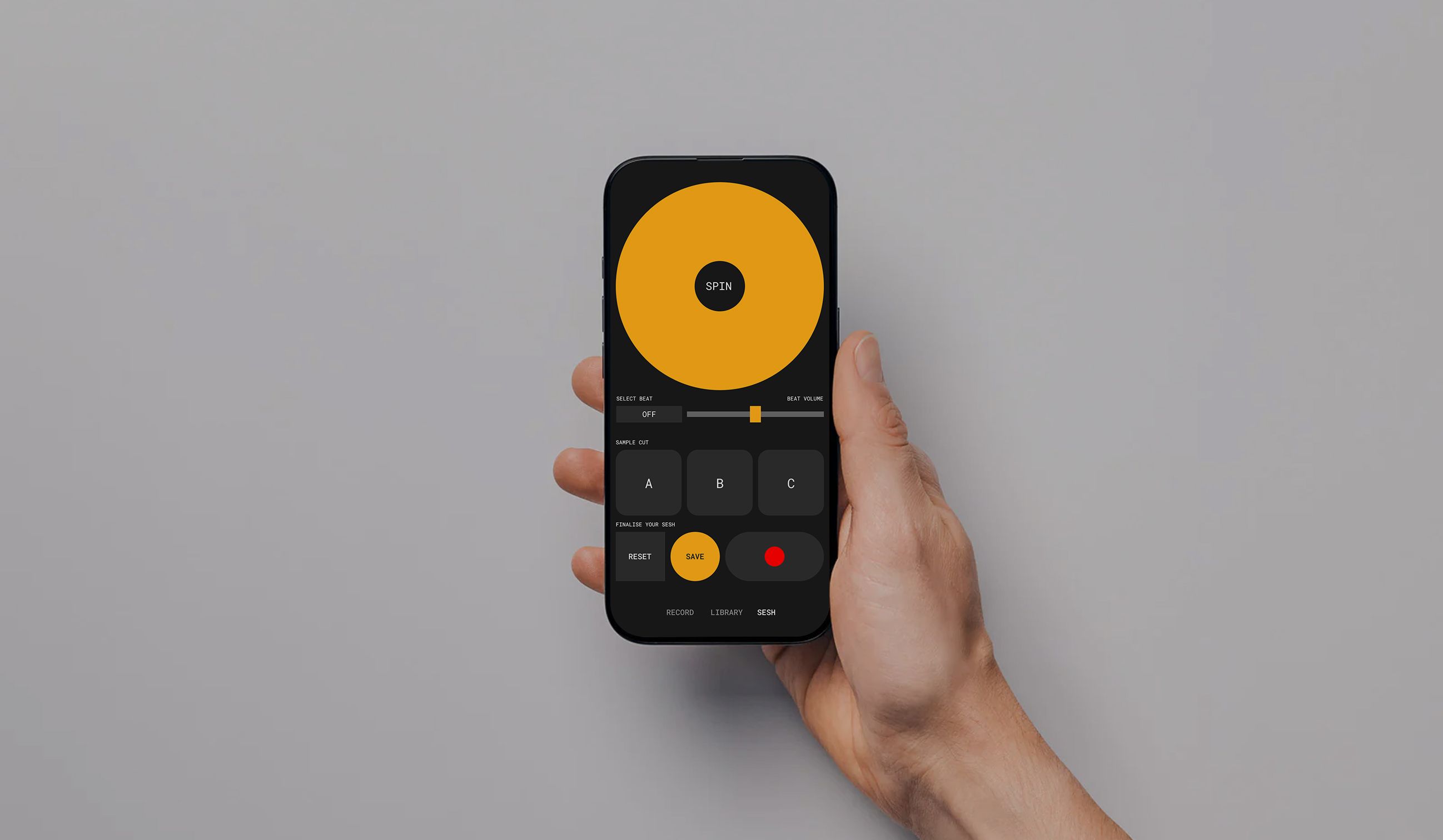
MONO
[Coming Soon]AmaWaterways
[Confidential]NielsenIQ
Approach
Jio
Leica
Coca-Cola
LCID
Supmates NFTs
IKEA
Disney
Enginuity
MONO
[Coming Soon]AmaWaterways
[Confidential]NielsenIQ
Approach
Jio
Leica
Coca-Cola
LCID
Supmates NFTs
IKEA
Disney
Enginuity
MONO
[Coming Soon]