— Form Follows
Founder


Project
The identity was designed to support the work, not compete with it. A deliberately muted palette, soft, natural tones, sits alongside the visual power of Luca's artifacts without overwhelming them. Colours that combine freely, and are built to last.
The mark is built from the negative space of the initials LC, its geometry drawn from the language of industrial production, structure, precision, and process. It reads simultaneously as a monogram and as a symbol of the discipline itself.
A systematic approach to storytelling runs through the entire identity: a framework for organising the narrative behind each piece of work, the material, the method, and the result. Not just a visual system, but an editorial one.
Role
Brand Design & Art Direction
Client
LCID
Studio
Freelance
Output
Brand Identity, Brand Strategy, Art Direction, Marketing collaterals
Supmates NFTs
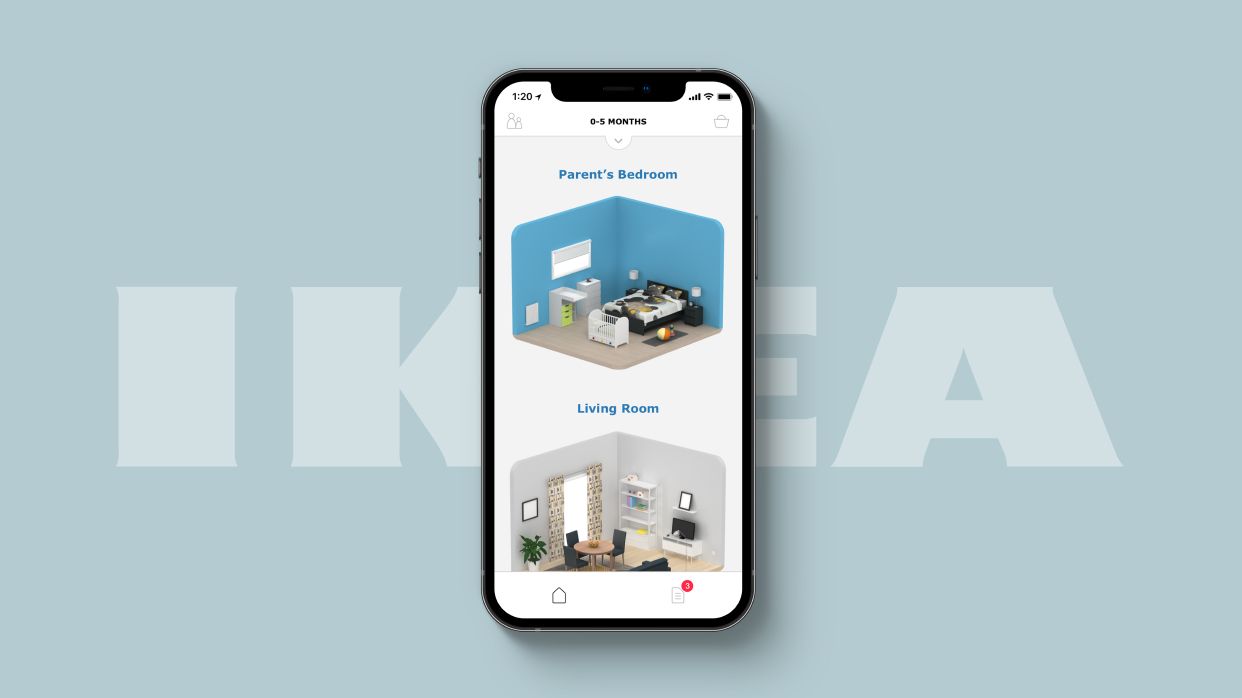
IKEA
Disney

Enginuity
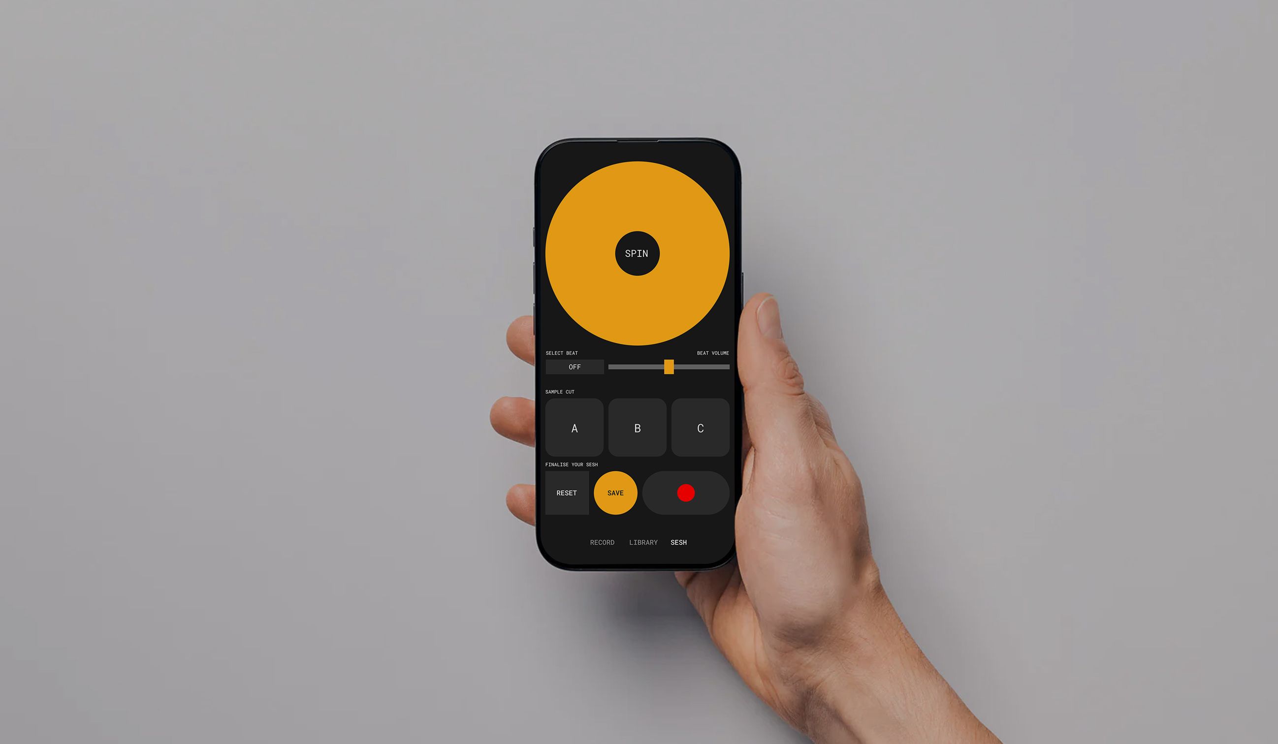
MONO
[Coming Soon]
Targetstar
AmaWaterways
[Confidential]
NielsenIQ
Approach
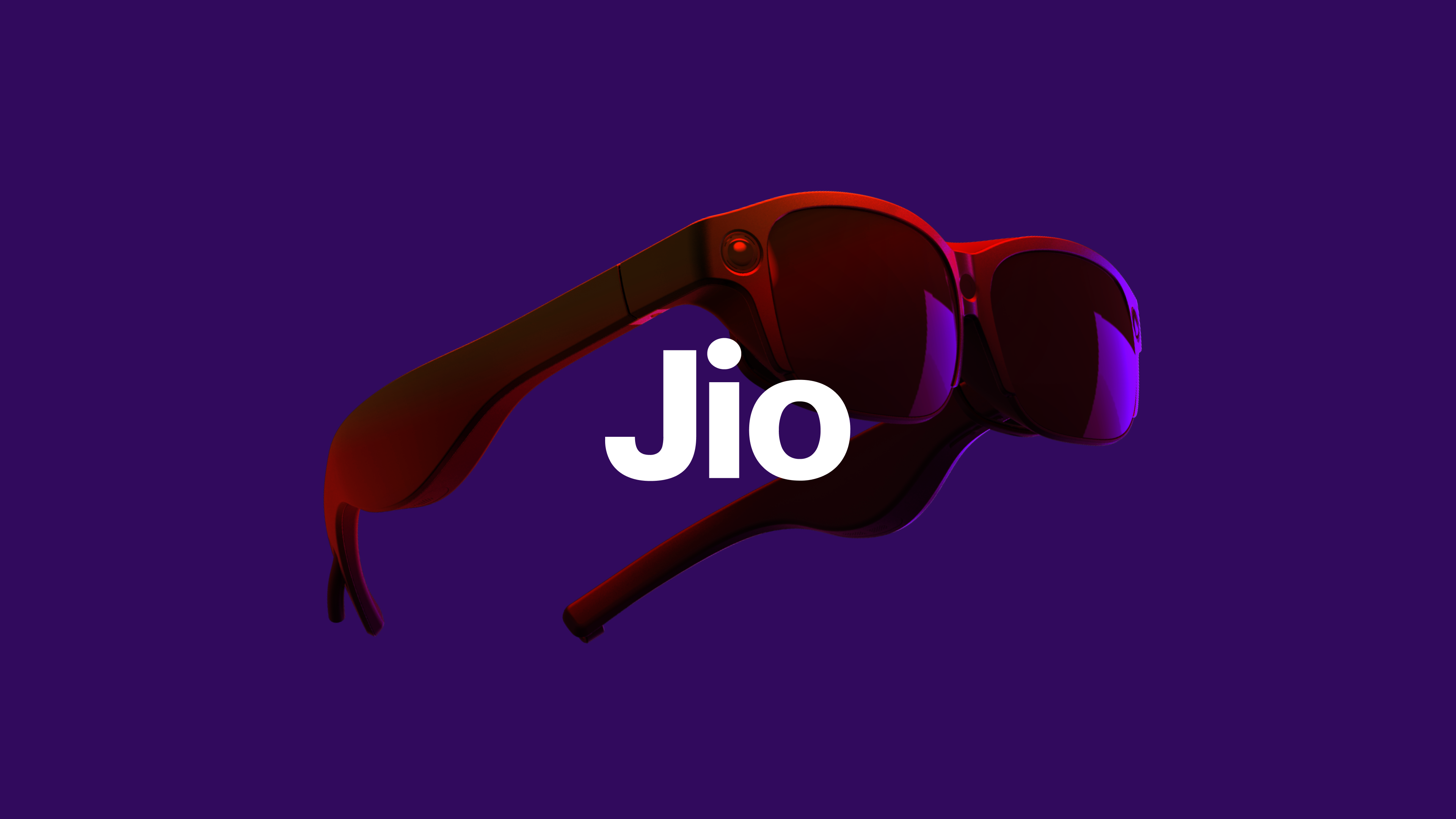
Jio
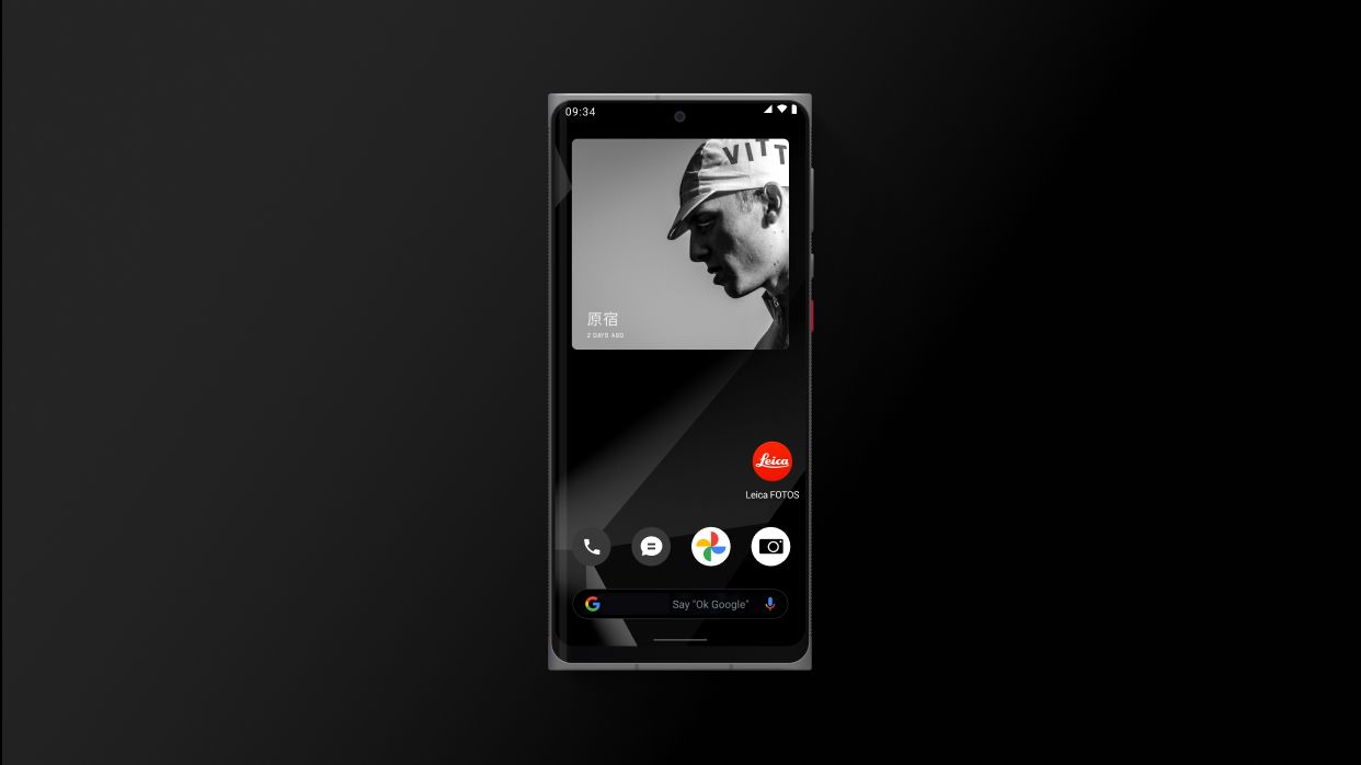
Leica
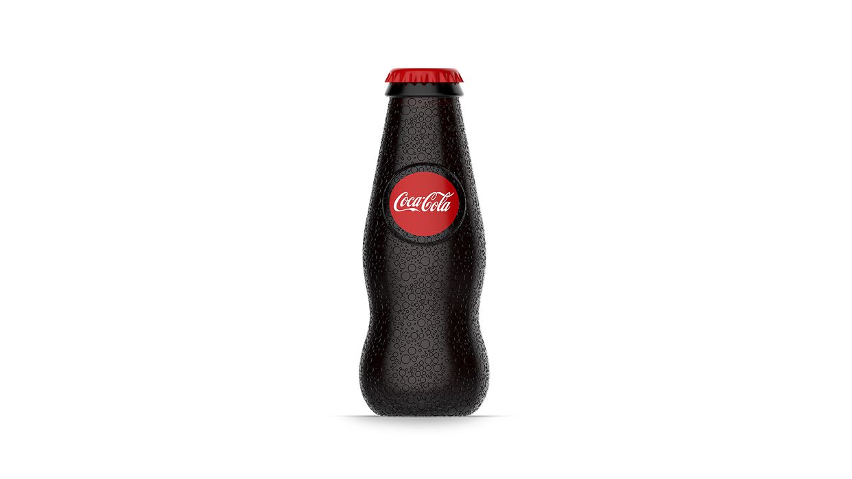
Coca-Cola
Supmates NFTs
IKEA
Disney
Enginuity
MONO
[Coming Soon]Targetstar
AmaWaterways
[Confidential]NielsenIQ
Approach
Jio
Leica
Coca-Cola
Supmates NFTs
IKEA
Disney
Enginuity
MONO
[Coming Soon]Targetstar
AmaWaterways
[Confidential]NielsenIQ
Approach
Jio
Leica
Coca-Cola